An ongoing exploration · 2026

A portfolio with more than one way in

My work spans brand, web, motion and physical products. Choosing one way to present it always felt like leaving something out. Even a detailed case study only shows a slice of what I can do, and less of who I am.
I wanted someone visiting between meetings to find relevant work easily, while leaving room for people who wanted to explore. The site brings those intentions together through three visual styles and a conversational guide.
The thinking behind the experience
I care about the details people notice immediately, and the ones they might never consciously notice. But I also work in marketing, where a design has a purpose beyond looking finished.
I try to think about what happens when the work meets the real world: what someone understands, how they feel, where their attention goes and what they do next. This portfolio is a place to explore those questions through the content, the objects around it and the way people move through it.
How the team worked
I organised the project around AI-assisted teams with different responsibilities: site planning, LLM planning, editing and implementation, copy, graphics and video, and LLM execution and deployment. I also used AI to explore alternatives and challenge decisions along the way.
These were AI workstreams I directed. I set the brief, reviewed proposals, chose what to keep, rejected what didn’t fit and brought the pieces together. The work extended across creative direction, interaction design, content, AI integration and deployment.
The site uses adapted Framer components and AI-assisted implementation. Keeping that contribution visible matters to the story: part of the experiment is how I can organise these tools into a team and take responsibility for the result.

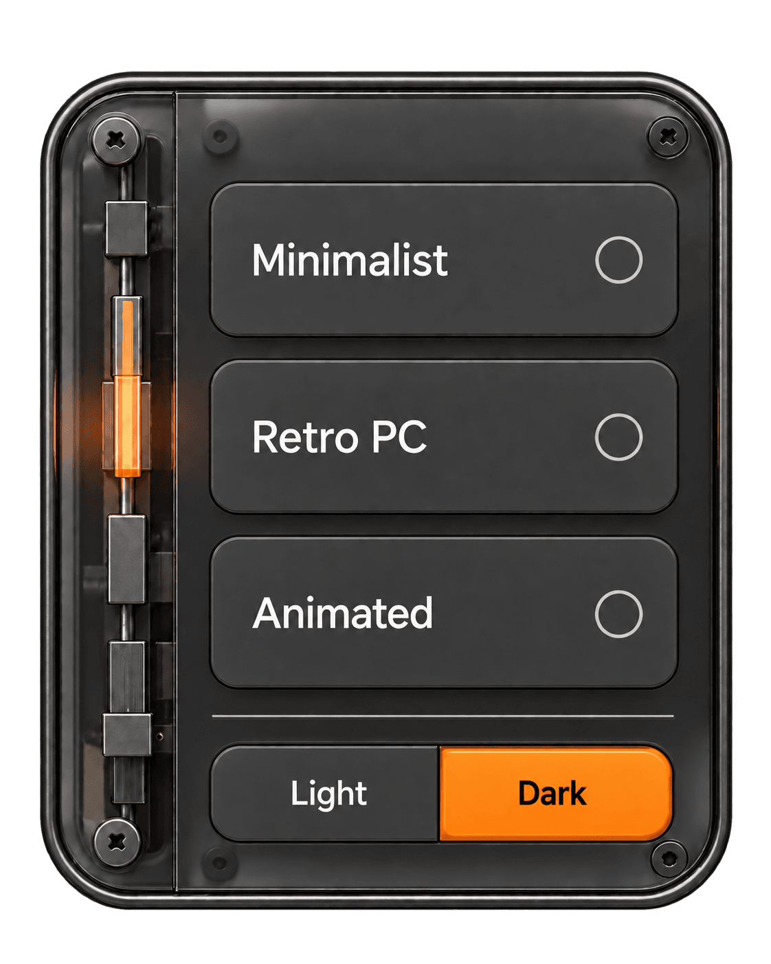
Three styles, three intentions
Minimalist
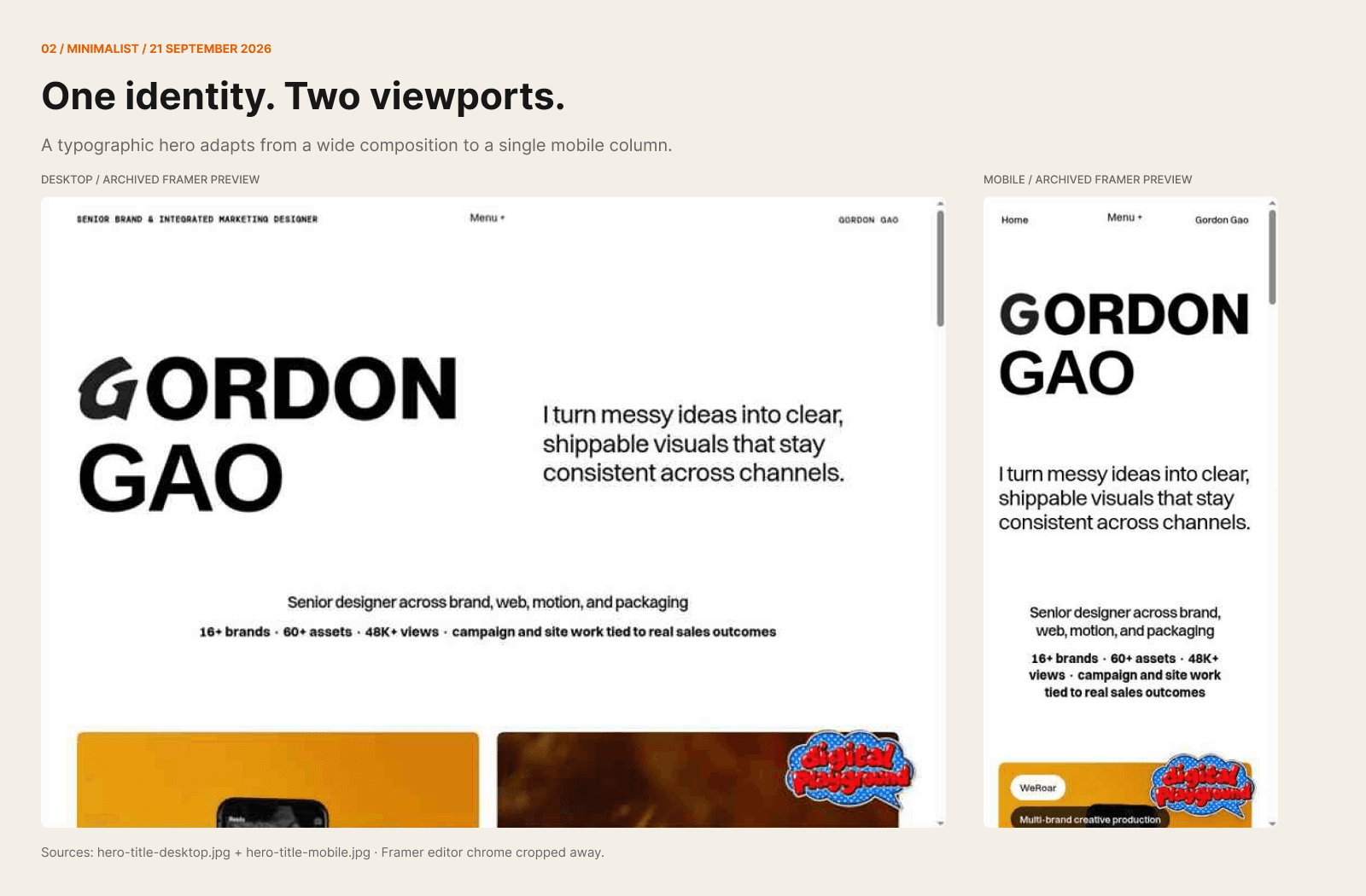
A clear, direct way to see the work. It gives visitors who are short on time a straightforward starting point, with the projects doing most of the talking.
Retro
Retro is a tribute to my industrial design background and my love of thoughtfully made objects. I’m drawn to work where the care extends beyond the visible surface, including details people rarely see. Steve Jobs’s comments about craftsmanship in unseen parts express something I connect with in my own work.
The computer setting and original-iPhone-inspired AI device bring that interest into the site. I wanted the experience to carry some of the character of a physical object: its proportions, texture, controls and the space around it.

Animated
Animated is an experiment in making browsing the web feel like a different experience. Scroll-driven movement changes how the projects appear and how the page unfolds. Scrolling becomes part of the composition.
Large previews and expressive typography give this direction its energy. The challenge is finding a rhythm that makes people curious while keeping the work readable and easy to reach.
All three styles share the same portfolio. Visitors can choose how they explore it without needing to see every version.



Decisions that shaped the result
Retro began with the idea of a rotatable 3D computer. I moved toward static computer artwork when the modelling and dragging added more complexity than I wanted for this build. That kept the physical character while making the scope more manageable.
To give the projects more room, I proposed three views: Setup, Focus and Expand. Visitors can move from the full scene to a closer view and then a larger content area with less casing around it. I also raised concerns about fast zooming and dizziness, which made gentler transitions an important part of the brief.
For Animated, I worked through several versions of the opening typography, adjusting the wording, relative scale and widths before requesting black and white vector wordmarks. Those changes were about how the composition reads as it moves.

How the presentation evolved
These process boards bring together recovered interface captures and reconstructed studies. They show how the directions developed across desktop and mobile; they are not all screenshots of working pages.



A conversation alongside the work
“Gordon, More or Less” gives visitors another way into the portfolio. They can ask about a project, my contribution or work related to their interests. Follow-up suggestions offer directions to explore, and project links bring them back to the work.
The name sets the expectation: the guide knows about my work and carries a little of my personality, but it doesn’t have every answer. For the full Gordon, you’ll have to say hello.
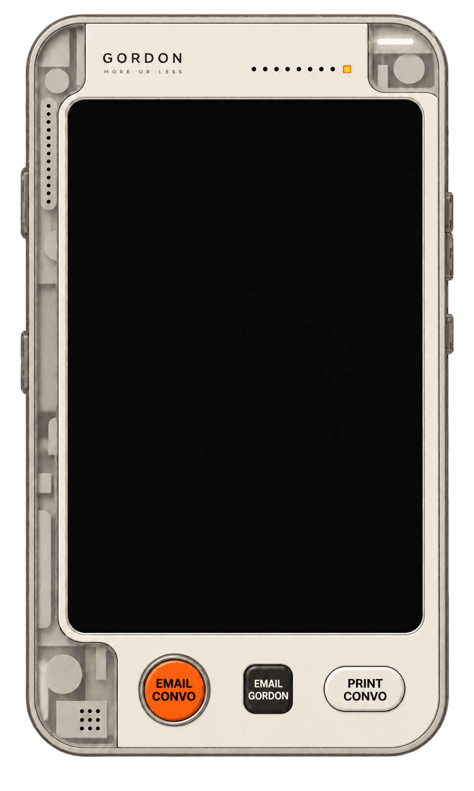
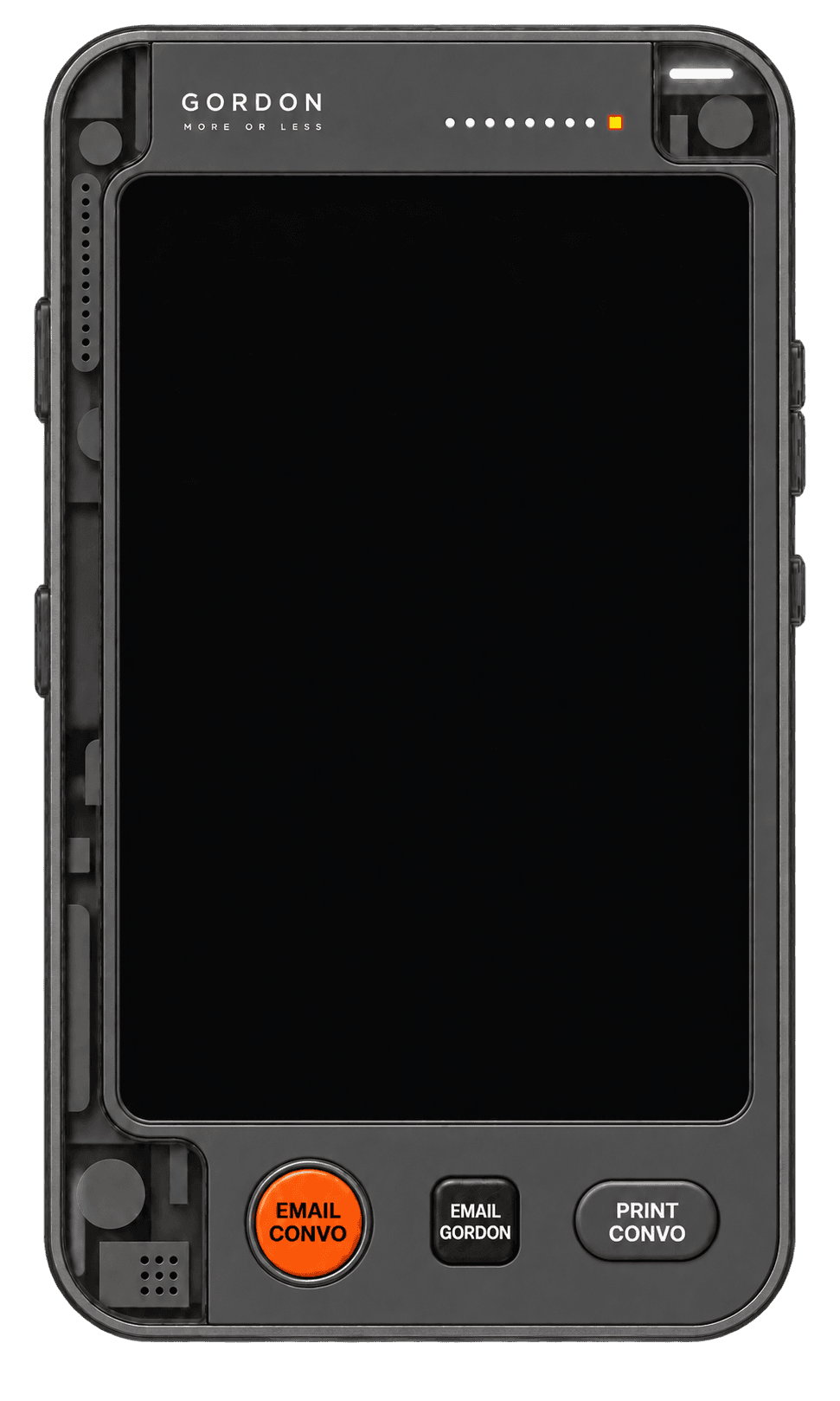
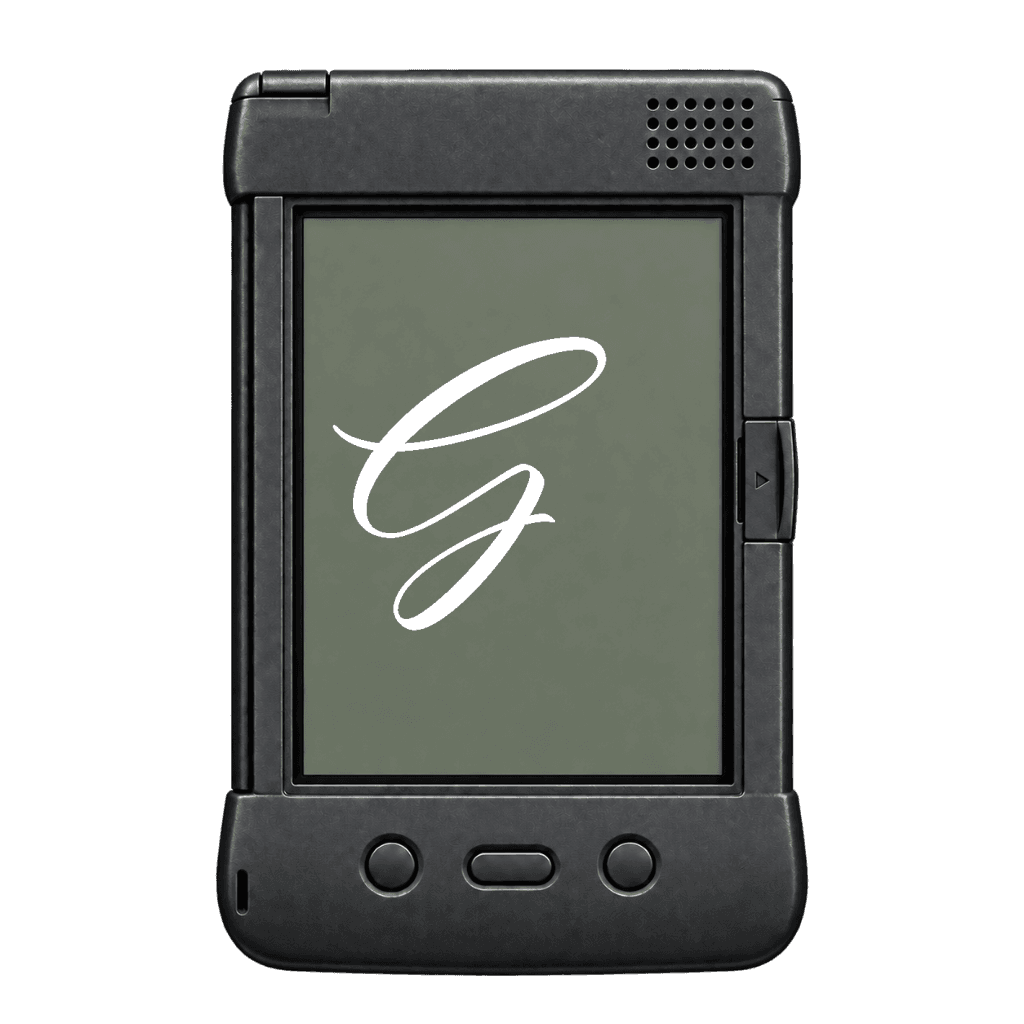
Its “handheld” form connects the interface to my interest in physical objects. The device changes with the style: a graphite PDA for Minimalist, an original-iPhone-inspired interface for Retro, and cream and graphite designs with orange accents for Animated. Each has a matching little launcher.

All four device skins
The same assistant takes on a different physical character in each style. Black screens keep the focus on the casing, materials and controls.

Three styles, one conversation
Small launchers for Minimalist, Retro PC and Animated. Explore their still, idle and interaction states.


My work.
Your way around.

An AI guide
to my work.
From interface to a working AI feature
The project also involved bringing the AI into the live experience: organising its approved information, shaping its voice and boundaries, connecting it to the interface, and working through deployment and testing with AI assistance.
I wanted the guide to help people explore without inventing project facts or pretending to be me. I also wanted the conversation to remain useful as visitors move between pages, hide the device or return to a draft.
Those requirements made the work broader than the visible interface. The content, behaviour and implementation needed to support the same experience.
Still exploring
This is a working portfolio and an ongoing experiment in design, AI and collaboration. I’m still refining what helps people find the work and what gives them a reason to stay a little longer.
The conversational portfolio idea was inspired by Rachel Chen’s RacheLLM. This is my own evolving take, built around my work, interests and ways of working.
If something makes you curious, ask. If something feels off, tell me.